Side Navigation Rail and Drawer
The Problem
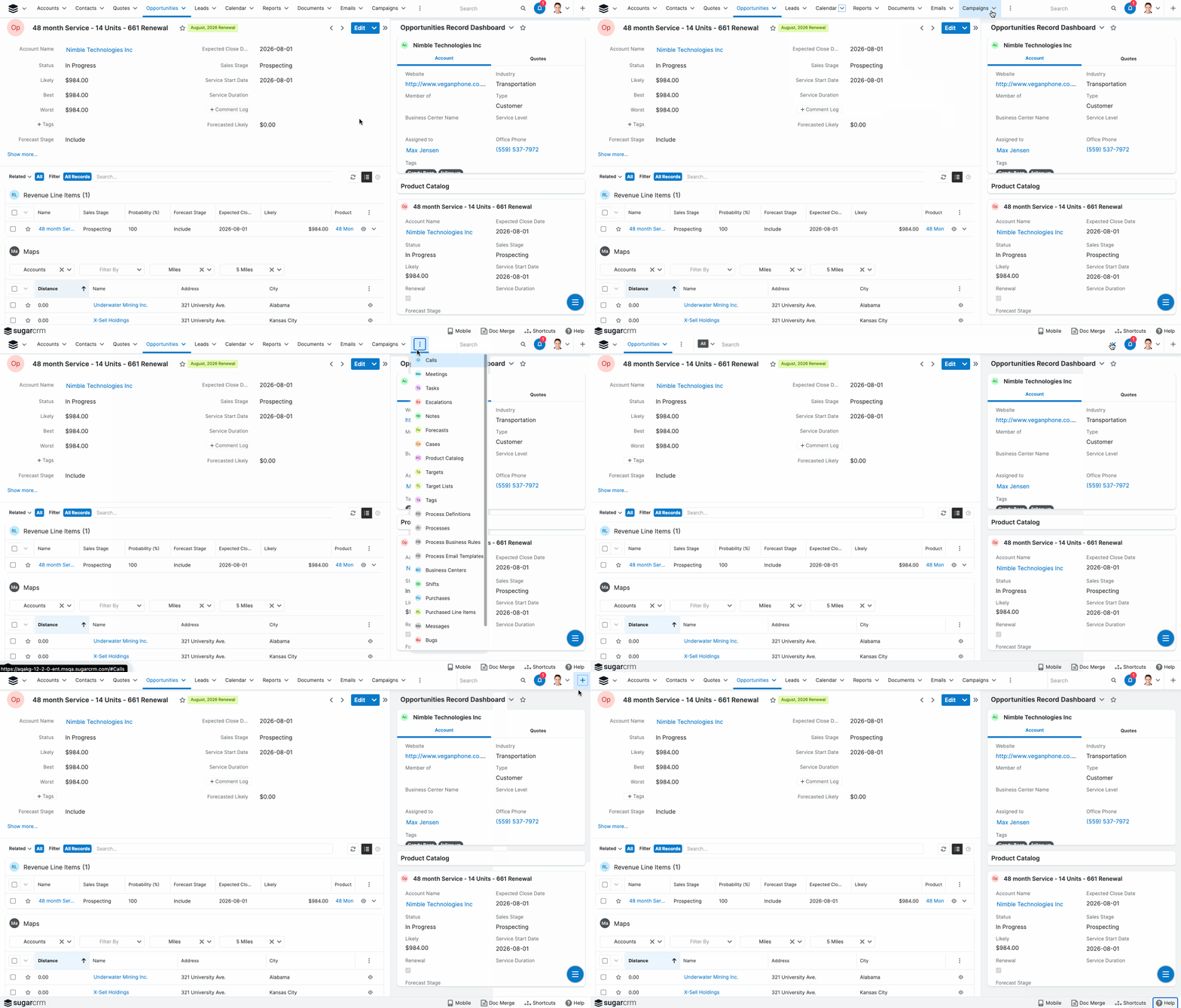
SugarCRM’s navigation system consists of a mega-menu and a footer, which is outdated and cluttered. Global search, the most frequently used feature in our app, has odd behavior to expand its width. The list of modules not on the top bar are shown in an overflow menu with no way to search through the list.
Hypothesis
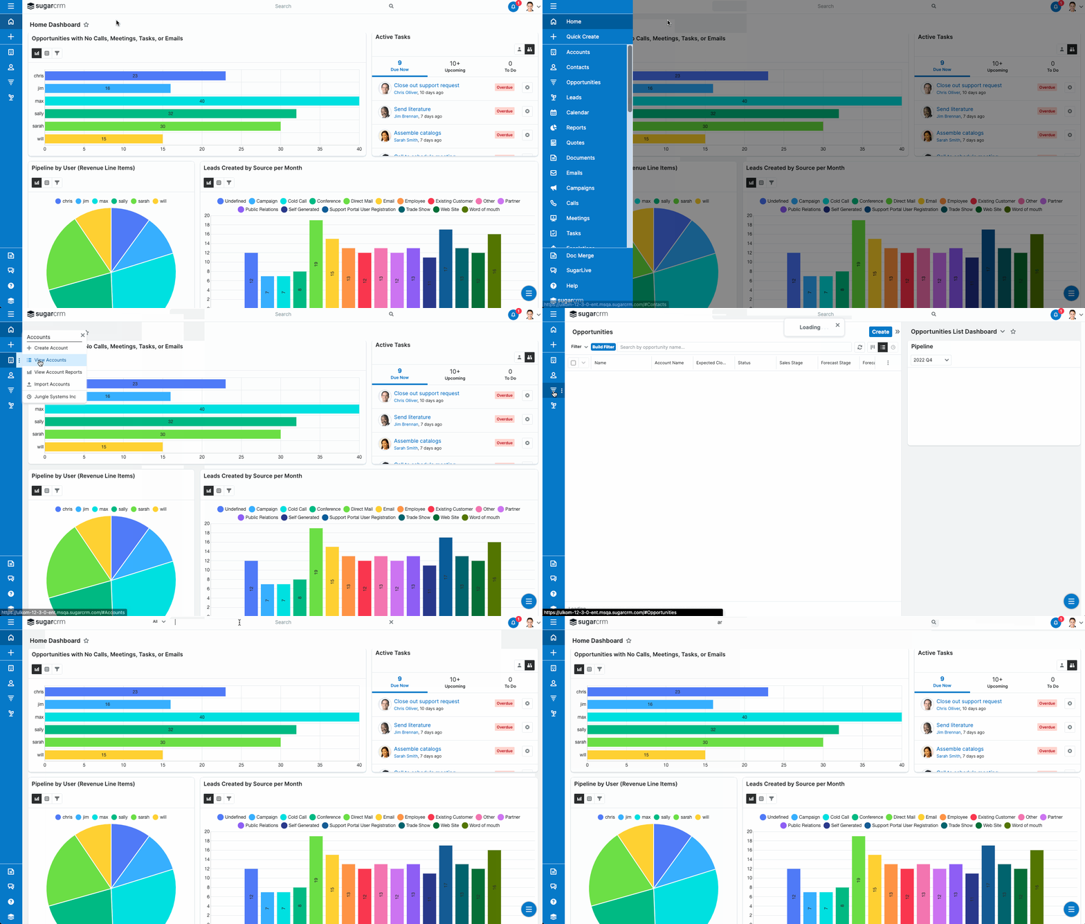
We believe that providing a simple rail and drawer navigation system, aligning with Material UI designs, will make our product look modern and accessible. It will also provide a clearer information architecture, by simplifying the location of navigation links on the screen.
The Components
With the new navigation system, a simple header replaced the previous mega-menu navigation bar. Since global search is frequently used, we moved it to a more prominent location and removed the expanding animation for a simpler user experience. We created a navigation rail to replace the header menu, with a drawer available to open for the full names of each link. Otherwise, the name of the link is shown on hover. The items previously in the footer now reside on the bottom of the rail. In the future, we would like the user to be able to search through the module list in the open navigation drawer.
Note: The recording is a little buggy, seen in the gray and white background changing.
High Fidelity Prototype
The full working prototype in Figma is linked here.


