Explainable AI for CRM Users
The Background
The SugarCRM data science team has the ability to predict the likelihood of a lead to convert and an opportunity to win. These predictions are currently shared with the user in the form of a percentage score 1-100%. The predictions can be seen on every lead or opportunity record. I was tasked with creating a UI to show additional information to these predictions to explain to users why a prediction landed into its bin.
Competitive Research
Before starting on sketches and low fidelity mocks, I looked at what other CRM products were providing for XAI including Salesforce, Microsoft Dynamics 365, and Monday. This research mostly confirmed my initial assumptions in how I wanted to arrange the elements in play.
The Components
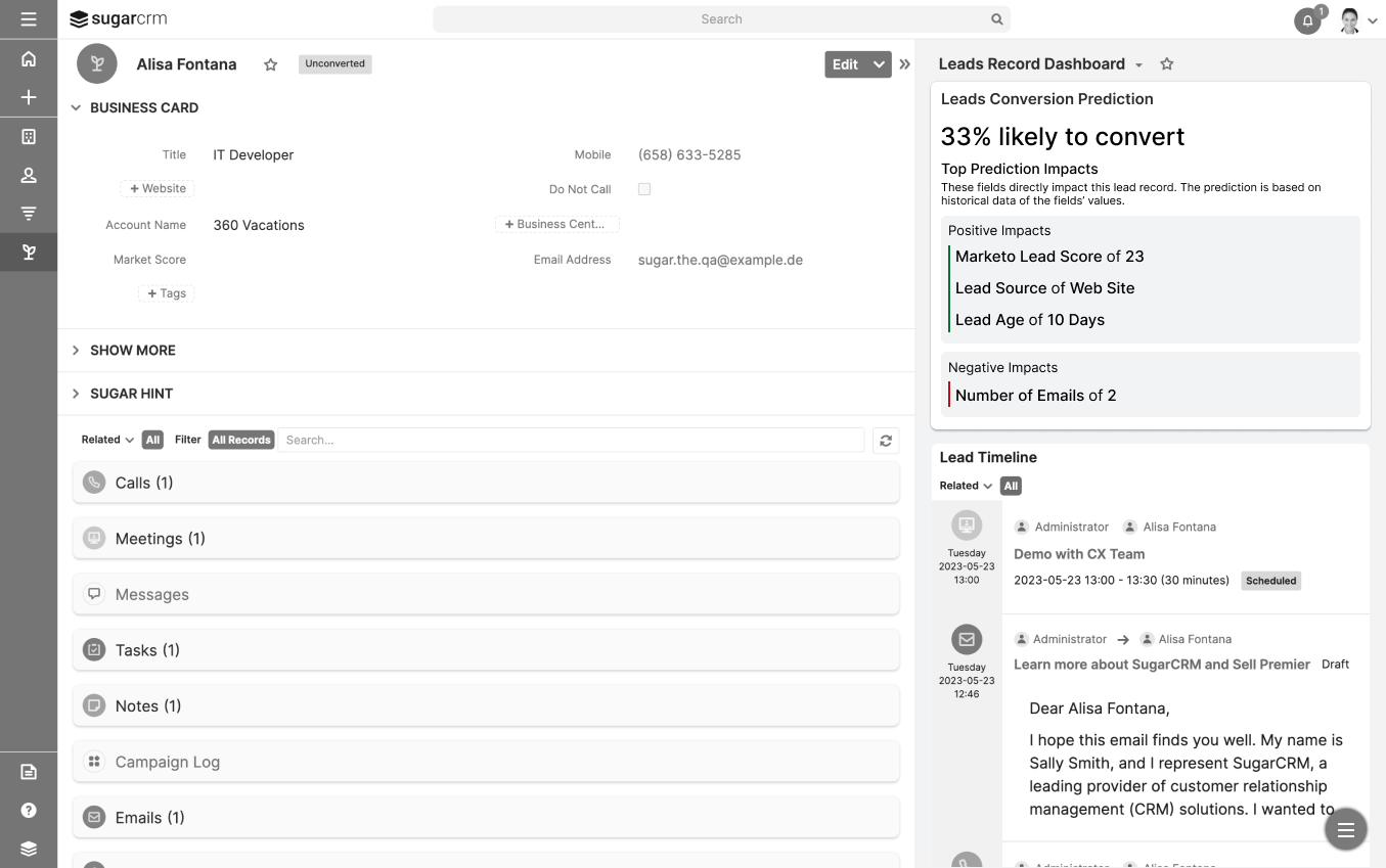
I decided to create a widget available on a Lead or Opportunity record dashboard that shows the prediction score and the top fields that made an impact on creating that prediction. The impact on a prediction can be either positive or negative and can range in severity of impact.
First Iteration of Design
Note: I grayed the background so you can focus on the widget.
User Testing
During user testing sessions, I showed users the widget and asked them to interpret what they were seeing. I wanted to be vague and open-ended in order to not lead them to the correct interpretation of the design. There was some confusion around the sliders that showed the severity of the impact so I decided to simply the design and group positive and negative impacts separately, removing the scale.
Final Design
Note: I grayed the background so you can focus on the widget.
I decided to simplify the prediction impacts by grouping them into positive and negative groupings, with a small addition of color. The widget is now easier to digest for the user at a quick glance.


